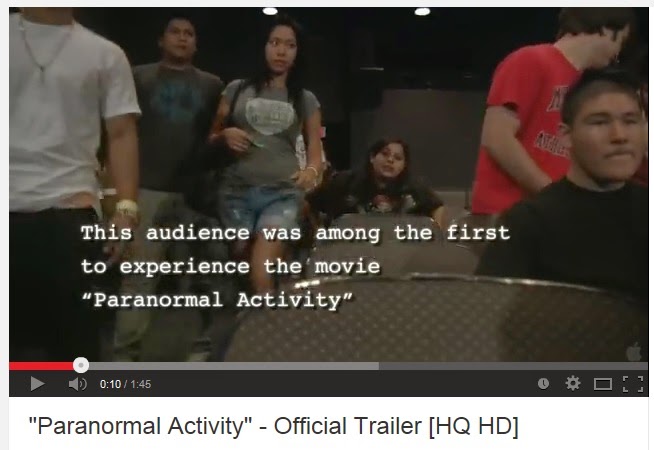
Another trailer I looked at was Paranormal Activity (2007). It is an American supernatural horror film. It is about a young couple, Katie and Micah, who are haunted by a supernatural presence in their home.
At the beginning of this trailer there is this warning message. This is similar to other trailers I have anaylised and have realised that on many horror trailers this message is displayed. Again it is on a green background with white text making it easy to read. There is also no sound allowing the readers attention to be completely focused to the message.
At the very beginning of the trailer there are shots of people going to view the film Paranormal Activity for the very first time. There are establishing shots used to tell the audience where and when the screening was held. There is also white text which gives the audience extra information about wehat is happening. The non-diegetic sound is the sound of the echoing of a drum. Each time the drum is hit the shot jumps to a different edit and is played while the rest of the drum echos. This creates a slow editing pace for the beginning of the trailer. Even though the pace is slow, it still creates tension and makes the audience wonder what is happening. The lighting is fairly bright and high key allowing you to see the audience clearly. This leaves the dark mysterious lighting for the rest of the trailer.
As the lights go down, like they would in a actual cinema, the lighting clearly changes my high key to low key. There appears to be a night vision lighting so that the audience can still be seen. An over the shoulder shot is used to allow us to view the trailer and the audiences reactions. The trailer jumo cuts to mid shots of the audience watching the film so that we are able to see there expressions. This is a unique way to advertise the film and allows the audience to want to experiance what the views already have.
From this point on the trailer stays fairly low key lighting making some of it hard to view. However this just adds to the sinister effect, making it more scary to watch as some of what you can see is unknown. As soon as the trailer begins there is a deep, lingering non-diegetic sound which continues throughout most of the trailer. This helps to highlight the tension the audience are feeling even more. At the beginning of the trailer the audience soon learn that the film is caputred using home footage with hand-held cameras. This lets the audience know that is meant to appear to be amatuer film instead of a high budget one. The mise-en-scene of the camera and and camera equipmetnt shows this.
Close-ups shots of the audience are used in the middle of the trailer to clearly show the audiences reactions as the action starts to happen. The shots convey the emotions of the people really well especially through the night vision light which helps to make it seem more creepy. The non-diegetic sound continues but makes less noticable under the screams of the audience. There are points in the film that make the audience jump, close up shots are used to capture there reactions.
Captions start appear on the screen in between quick pace shots of the couple traumatised by what is happening. The text gives quotes of what people thought which help advertise the film and make the audience want to see it more. The editing still applies with the rest of the dark lighting using a black background.
Towards the end of the trailer images appear which show the bad things that are happening to the couple, such un-explainable brusing on her back. The women in frequently wearing dark clothing which implies that she is the victim. Close-up shots are used to display her injuries and how bad things have got. Diegetic dialogue back up the point "its not the house, its me."
The pace starts to become quicker as the cuts become more jumpy and flickering. At this point the audience arent in the scence anymore and instead the film takes up most of the screen. In between all this fast shots are images of words which put together say "experiance it yourself". The drum sound speeds up as the pace of the trailer becomes quicker.
The pace of the trailer increases even more at the end with plently of quick jump shots between the audience looking scared and the film. The title of the film is displayed however it flickers and shakes to give a creepy effect.
Here is the poster I anaylsed for paranormal activity.
Reflection on Trailer and Poster
Pace of trailer
This trailer starts of with a slow pace at the beginning which represents the normal everyday and then increases to a fast pace when everything starts to go wrong. The cuts become more jumpy and I think this effect works really well. As the pace increases the atmosphere becomes more tense and the audience can tell that things aren't going to go well. I want to use this change of pace in my trailer to make it more interesting. As the action increases, I will increase the speed of editing.


Use specific media terminology when talking about shot types, editing techniques, mise en scene & sound - refer back to your AS work for this.
ReplyDeleteSome good observations - how does this trailer conform to paranormal horror conventions? Does it challenge them in any way? What elements will you try to incorporate in your own trailer production?