Tuesday 10 February 2015

Discussion of Media Theorists

Vladimir Propp’s Character Types 


1. The Villain who struggles against the hero. 
2. The Donor who prepares the hero or gives the hero some magical object.
3. The Helper which helps the hero in the quest.
4. Princess and the Father- gives the task to the hero, identifies the false hero and marries the hero. (can be difficult to distinguish)
5. The Dispatcher, a character who makes the lack known and sends the hero off. 
6. The Hero or victim/seeker hero- weds the princess
7. False Hero- takes credit for the hero's actions and tries to marry the princess. 

I researched into Vladimir Propps character types and tried to place my characters into these seven different types. I think my scary character played by Laura White fits well into the Villain character.
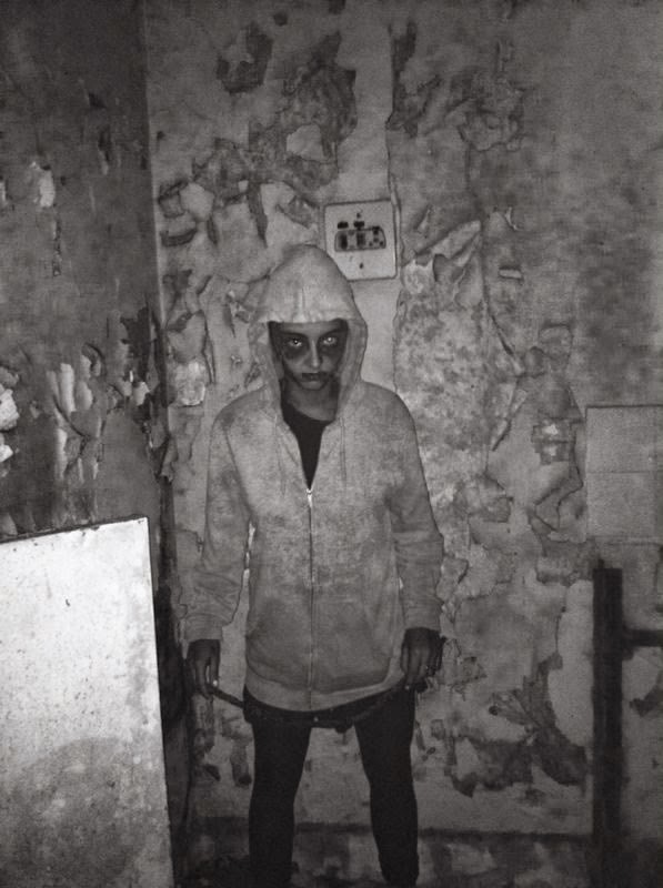
Laura plays the character of the lost little boy who tries to scare the two girls, Imogen and Sophie.
Imogen and Sophie act as the Princess acts from Vladimirs character types as they are seen as vunerable, weak and need saving. However, these character types are fairly vague and are more siutable to a fairytale story. I don't think all these character types are always found within the horror genre and some characters may be missing. The hero is not always present and doesn't always rescue the princess or fights the villain. For example, in super natural horrors the villain isnt always shown or ever seen by the audience espeically in films such as Paranormal Activity.
 
 
Tzvetan Todorov's Narrative Theory
 
Todorov propsed that all narratives whether that is a book, play or film contain these five fundamental stages in this order:
1. A state of equilibrium- when everything is as it should be in a state of equal balance.
 
2. A disruption of that order by an event- (disequilibrium)
 
3. A recognition that the disorder has occured
 
4. An attempt to repair the damage of the distuption
 
5. A return or restoration of the new equilibrium.
 
In these stages, narrative is not seen as a linear structure but a circular one. Todorov argues that the narrative invovles a transformation. The characters or the situations are transformed through the progress of the disruption.
In my film the two best friends, Imogen and Sophie are living a normal lifestyle until their car breaks down creating stage two of Todorov's narrative theory. The car breaking down creates disruption and this is when disorder occurs. When the two girls head off to find help and end up venturing into a haunted house. This is the stage 3 in the theory were the disorder is recongised. Number 4 and 5 stages of the theory aren't shown in my trailer as this would give away too much of the storyline and spoil the film itself.
 
Roland Barthes Codes Theory
 
Barthes describes a text as, "a galaxy of signifiers, not a structure of signifieds; it has no beginning; it is reversible; we gain access to it by several entraces, none of which can be authoritativley declared to be the main one..."
 
However, what Roland Barthes is trying to say is that the text is like a tangled ball of string. The string and the string needs to be unravelled. Once the string is unravelled, we encounter an absolute wide range of potential meanings. We can start by looking at a narrative in one way, from one viewpoint, one set of previous experience and create one meaning for that text. You can continue unravelling the narrative and create an entirely different meaning.
Barthes stated that texts can be 'open' or 'closed.'
Roland Barthes narrowed down the action of a text in to five different codes:
 
1.The Hermeneutic Code- This is the way in which a story avoids telling the truth or revealing all the facts, in order to drop clues to help create mystery. My film trailer does this well as I don't reveal the whole truth behind why the little boy has been left in the abandoned house or as to what he does the the vunerable girls. This then creates mystery to the storyline and opens up unanswered questions.
 
 
2.The Enigma Code- This code is the way that tension is built up and the audience is left guessing what will happen next. This is a very important code when it comes to horror genres as you want to keep the audience intriguied and excited as to whats happening. Especially in a trailer, the Enigma code is vital in keeping the audiences attention. I think I have done this well by creating a fast pace editing and intriguing sounds, when all placed together create a strong sense of tension.
 
3.The Semantic Code- The semantic code points to any element in a text that suggests a particular, often additional meaning by way of connotation which the story suggests. For example, my isolated area where the film takes place, straight away is associated with the horror theme as this gives the charatcers no where to run and allows the action to increase in one specific area. An isolated location indicates that no one is around to help them which in turn creates more chances for actions to go wrong. Also, the lighting can connotate what film genre it will be. Low key lighting is extremly stereotypical for a horor film as the connction between dark and the unknown makes the audience aware that the following actions won't be good.
 
4. The Cultural Code- The Cultural Code looks at the audiences wider cultural knowledge, morality and ideology. In other words, the cultural codes tend to point out our shared knowledge about the way in which the world works. For example, automatically we begin to feel worried for the two girls because in society girls are seen as the weaker gender and therefore more vunerable. This is why when I first started filming with both the boy characters and girl characters I felt the horror theme was not as strong. Whereas without the boys the girls seemed more vunerable and unprotected.
 
5.The Symbolic Code- This code is quite similar to the Semantic Code, however acts at a wider level, organizing semantic meanings into broader and deeper sets of meaings. This code is more about the symbolism within the text. It usually utilies the opposites to show contrast and create greater meaning. For example, in my trailer the clothing and appearance of the two girls is the complete opposite of the scary character. The girls look clean and well dressed whereas the little boy looks dirty and unkept.
 
Claude Levi Strauss
 
Claude Levi Strauss studied many myths and legends from all round the world. After looking and analysing these he found out that we as humans make sense of the world by seeing and using binary opposites. He discovered that narratives are arranged around the conflict of binary opposites.
 
Good vs Evil
Black vs White
Boy vs Girl
Protagonist vs Antagonist
Peace vs War
Young vs Old
Strong vs Weak
 
I think this theory is very strong because after looking back at the trailers and films I researched all of them follow this theory. My trailer also follows this theory as I have the good characters who are the two girls and the bad character of the little boy. I also have the opposites of clean and dirty, strong vs weak, the girls are clean and freshly dressed however are protrayed as weak whereas the boy is dirty and unkept ans seen to be strong.
 

Friday 30 January 2015

Evaluation

Question 1- In what ways does your media product use, develop, or challenge forms and convention of real media products? 


Question 2- How effective is the combination of your main product and ancillary texts?

Looking back at my overall production I am very pleased with my combination of trailer, poster and magazine cover. I am happy with how they have all eventually tied in together to create a promotional campaign that I believe is effective.
Firstly, when looking at my magazine and poster there is a clear consistent colour range throughout them. I have used three main colours, black, red and white to keep a colour theme that relates to the film. These three colours have worked well together and represent a horror them genre. When looking into other promotional campaigns I discovered that most films had a set of colours that represent the film and remain remorable to the film itself,  I then took this idea upon my campaign. The colour red connotates blood and stands out against the black background. This colour was found a lot when I was researching other promotional media texts and was almost always present in the horror genre. Most posters and magazines I researched had a dark background colour which allowed text and symbols to stand out and which then creates a visually pleasing advert. The text is easy to read and when passing quickly can be read at a glance. I have used typical conventions of the horror genre, such as fast editing in my trailer alongside a scary unknown character. In my poster and magazine cover I have used close up shots to create a relationship between the audience and the 'scary' character. Having direct eye contact from the character on both the poster and magazine creates a feeling that the 'little boy' is staring at you in particular, playing the on horror conventions. I believe the mixture of codes and contentions have been successful throughout all three of my pieces of work. Simple conventions such as the style of font make a big difference when creating different adverting campaigns. I decided to keep the font of the title of the film the same on both the poster and magazine and it also fairly similar in the opening sequence of my trailer. My actor is wearing the same clothes and make up throughout all three pieces of work which adds character and becomes more memorable. The item of clothing is then connected to the particular charatcer and will help with comparisons between the poster and magazine. If the character was wearing different clothing and looked different in all three pieces the audience by get confused on who the character is ment to be or connate. After recieving plently of feedback throughout the proccess of this project I was able to edit and adapt on what my peers thought of my work. A key element that I worked on was te font and style of my text on both the poster and magazine. I spent quite a lot of time choosing and working out with text best suited my theme and looked most professional. With help and advice from my peers I came to an conclusion and I am happy with the outcome. I think the text looks professional and clear yet works well with my theme.
If I was to re-do these three tasks or had time to improve them I would re-shoot some of the shots for my trailer. Even though I believe I had a range of shots and different angles in my trailer, if I had more time I would have liked to been able to go back and film on a high quality camera and capture a few more shoots. I feel this would have just added a bit more to my trailer if I had one more different location as well as the abandoned house and roads. Also I would have liked to have more time to experiment with the editing software Adobe Premiere as I had never used the programme before starting this coursework. I wasn't completely confident on how to do everything when it came to editing my trailer and had to teach myself as I went along. This then let down my editing skills as the time it took for me to learn the software then left less time for me to begin editing. If I had more time to do this production again I would have spent a few more days using Adobe Premiere to learn more about what editing I could do. I believe this then would have improved my trailer a lot. I am happy with my poster and magazine cover and don't think much more time or resources would help to improve them that much. I have a good understanding of photoshop and indesign therefore knew exactly how the softwares worked and didn't waste any time.
In conclusion, I have generally happy with the results of the main product and ancillary tasks and believe I worked to the best of my throughout all three.

Question 3- What have you learnt from the audience feedback?


4. How did you use new media technologies in the construction and research, planning and
evaluation stages? 

Magazine Cover Making


To begin with, I went through all my images from my contact sheet and decided on a image to use. I chose a portrait image as this is the normal style of a magazine and would work better when I started adding text. I edited my image in Photoshop and firstly removed the ties and logo from the jumper. I used the clone tool to cover up the unwanted parts of the jumper and I am really pleased with the outcome. 


I then darken the outside of the image by using the paint brush and gradient tool. I wanted to create the effect that the character was lit up in the middle, which I had also done with my poster. 


I placed the image into InDesign so that I could add text. I changed the title of the magazine a few times until I decided on one. I also struggled with choosing which font I wanted for my magazine title. I decided on a bold but simple text that would be memorable. To make it a memorable name title I changed the colour and sizing of the letter 'M'. This has made the title slightly more unique and also follows with the colours of the magazine. I added the typical features that you find on a magazine cover such as the price and bar-code. I placed these to the left side, just under the title because when researching and viewing other magazines on the market I found that this was a popular location on the cover.
On my magazine cover I used buzz words such as 'plus,' 'win' and 'exclusive'. These words make the audience feel as if they are buying information that can't be found anywhere else. Having the word exclusive central and in large font makes it stand out on the page. It helps to make the potential buyers more inclined to want to read the magazine and find out what is inside. 
Final Magazine


Audience Feedback 


I uploaded my final magazine cover to Facebook to receive audience feedback. Overall the comments were positive and people liked the cover that I had produced. Katie liked the design of my magazine title with 'M' standing out against the other letters. If I was to re-do my magazine cover I would add another image to the film strip and make the text slightly bigger and stand out more in the read circle.


Thursday 15 January 2015

Film Poster Making


This the contact sheet for my images I took for the film poster and magazine. I took images in portrait style, as well as landscape as I wanted to experiment with the framing of my images. Also, from my research I discovered that many other popular posters varied in style. However, most magazines were portrait style therefore I needed a good amount of different shots to try and get the best one. I tried to capture close up images as well mid-close up shots so that when I came to choosing which images to use I would have a good range to choose from. I decided against taking and long, body shots because I thought that the direct eye contact would create more of a connection between the audience and the scary character. 


After choosing the image I wanted to use for my film poster I decided to edit out a few things from the image on Photoshop. I got rid of the strings on Laura's hoody because I didn't think they suited the image and took some attention away from her face. I successfully did this and was happy with the outcome.  


I edited the image so that a lot of the picture was dark, this then allowed me to place text on top. Also as my film is a horror film I wanted the poster to represent this and thought that using dark colour would be best. From my research Id found that a lot of horror film posters used dark colours and red writing (maybe representing blood) which indicated that the film was going to be of a horror genre. 


When adding text I used the software 'InDesign.' The text is very important on a film poster as many poster are only seen as a glance as someone drives or walks past therefore the text needs to be easy to read and stand out. I played around with using lots of different types of fonts and sizes but in fact found it very hard to choose a style of font for my film title.


Audience Feedback 

I decided it would be a good idea to gather some audience feedback about my poster so far in the process of designing and making it. I uploaded an image onto Facebook and asked my friends to take a lot and comment on ideas to improve and what is working well. 
The comments I received helped me to develop and improve my poster. From the feedback I worked more on improving my title and making it stand out more against the dark background. I took both Katie's and Beth's comments on board and changed the style of the title.  


I tried to make the title look as if the writing had been scratched and ruined however this effect made the actual title less visible. I liked the idea but it made the title stand out less and was more difficult to read at a glance. So I came to a conclusion after trying out different styles that the best text was to use a simple font with a bright red colour. The red stands out well against the dark black background and therefore it is really easy to read from either a distance or a quick glance. I included a sentence at the top of the poster saying what other films have been produced by the same company. This could then encourage people to see the film because they liked the other two films made by the company.  I used quotes on my poster, to again encourage people to go and see the film because it is showing to have had good reviews. 


Audience Feedback


I decided to get some feedback using the social media website, Facebook.  I uploaded my final poster and get my friends to comment on what they thought the final outcome was like. Mostly the comments were positive and the feedback said it looked professional. From my audience feedback I realised that my title 'Dear Little Boy' could have been more interesting and made to stand out slightly more. If I was to re-do my poster I would spend more time getting my title to look more unique. I did spend a lot of time playing around on photoshop with the text and trying lots of different styles, however because my photoshop skills are completely amazing I lacked the knowledge to be able to do exactly what I wanted which results in a more simple title. I am still pleased with my title because it is easy and simple to read from a glance which is important for a poster.