Friday 27 June 2014

Analyse: student trailer

 I analysed a previous students trailer to see how they created a trailer. 


One of the first shots the audience see is this mid shot ofa old man. This shot allows the audience to establish who the main character of the film is and some details about him. In this case, he is painting with only candle light which makes the situation seem a bit creepy. The lighting is fairly red which is a bit odd ans suspious. There is non-diegetic sound of chimes which doesnt seem to fit the image. However the chimes beating creates a creepy atmosphere and implies that the man the audience can see isnt as innocent


This student has used a original symbol and made up a production company to produce their film. I think this symbol is really good as it looks like realistic company that would produce a film. In many trailers, there are points in the trailer where companies are shown and advertised therefore this is using the typical conventions of a film trailer.


At this point in the trailer a voice over begins as well as the non-degetic sound of the chimes. The first dialogue we hear is 'He was an artist.' This close up shot allows the audience to recongise that the voice over is all about the man we can see right now. The extreme close up shot of his eyes gives the emotions and expression of the man, allowing us to understand him more.


The editing at this point in the trailer makes the shot look as if it is from a cctv camera. The black and white colouring makes is seem a bit spooky however high key lighting is still being used. I think to make this shot look better, the lighting shouldnt have been so bright which would make the shop seem a lot more scary. There is orchestral music that is playing, however I dont think this music fits the scence. This is called contrapuntal sound.


Lighting plays an important in this shot. The only light used to light up this shot is the street lamp.  There is low key lighting apart from the street lamp therefore the audience are aware it is night time. The silhoutte of the women makes her seem vunerable and alone. The fact the audience cant see her face or body, only the outline of it, makes it seem spooky. 


This is a extreme close up shot of a painting that the main character has painted. The fact that the shot only shows part of the painting makes it seem a bit creepy. It makes the audience wonder what the rest of the painting looks like and why only a part of it is showing.


Strengths

  • strong range of shot types
  • good quality of filming
  • very good use of lighting to make character seems vunerable
Weakness

  • maybe the audince could have seen a few more characters that would have been featured in the film


Thursday 26 June 2014

Analyse: Students work poster

I anaylised a previous students work and wanted to see how they compared to popular horror film posters. I think this was a fairly good film poster and used the typical conventions of a horror film poster. I like how the poster has been laid out. The mid close-up shot works well as the audience get to see the main character and her face. Thr direct address works really well, especially with the coloured eyes.

Reflection on Poster

Layout
I like the layout of this poster and think the landscape style works well. It allows for more text to fit on the page as well as a decent size image. I plan on using landscape for my poster but will experiment with portrait as well. If I was this student designing this poster I may have used up a bit more of the blank space. There is a lot blank space either side of the picture which could have been filled with star ratings or comment from the audience.

Wednesday 25 June 2014

Analyse: Orphan film poster

Orpahn is a psychological horror, in which, a couple adopt a mysterious orphan named Esther who turns out to be a pychologically distured adult women.


Reflection on Poster
 
Eye Contact
I really like the use of direct eye contact in this poster. I think it works really well in contenting the audience with the emotions of the character. It also makes the audience feel on edge as if they character is looking at them in specific. I want to use direct eye contact in my poster to make it seem as if my scary charatcer is looking directly at someone.

Tuesday 24 June 2014

Analyse: The Hills Have Eyes trailer

I looked at another horror film called The Hills Have Eyes. It is about a suburban American family that are being stalked by a group of psychotic people who live in the desert, far away from civilization.


The beginning of the trailer starts with some white text against a black background. The text gives the audience some information about the story line of the film. The text is easy to read and is central on the screen. There is non-diegetic sound of a high pitch, nuclear siren noise which doesn't seem to relate to the text straight away which makes the audience question what is about to happen next.


The next few images show flickering images of abnormal/ usual looking body parts. The flickering effect makes them seem even more usual and as if they arent ment to be seen. The black and white colouring makes the images seem old and rare. There is a sound which almost sounds like a tv being tuned. These images are then followd by exploding buildings and bombs going off which matches the text at the beginning. There is a lot of bright light which at points makes it hard to see what is happening.


After the exploding building images the screen fadesa to black and the sound also fades out. The non-diegetic sound completely changes to an upbeat, country song. The whole atmosphere of the trailer completely changes, creating a happy, holiday feel. The colouring of the trailer also changes from black and white to bright colours. This change may represent how the family are going to be affected by the unknown people that the audience saw at the beginning of the trailer.


This establishing shot shows the location that the film will take place. It is the first shot we see of the location, it also makes the family look very vunerable as there is no one else around. Just before this shot there are quite a few close-up shots of the family which identifies the main characters of the film. They all look very happy and as if they are enjoying themselves, however the audience are clearly away that something is about the change that. All these shots are companied with non-diegetic happy music which implies that the happiest is all about to change. 


This close up shot is the last shot before the non-diegetic music stops. The close up shot looks as if it gets stuck on the page and flickers up and down. The last dialogue comes from the local man, 'Have a safe journey.' This is use of dramatic irony as the audience are aware that they wont be having a safe journey however the characters arent away of this.


After the screen fades to black and the music stops the atompshere of the trailer chnages again. There is diegetic sounds of the wind blowing, birds and the trucking driving along. The pace of the editng becomes faster with more shots fo the action and quicker shots that fade to black. A non-diegetic beat begins which almost sounds like a heavy heart beat which creates a spooky sense. 


At this point in the trailer there are lots of fast pace shots of the mian characters being attacked by the unknown creatures. The characters going in pain and scared which matches the sounds of them screaming. The colouring of the images changes slightly and becomes a yellow tone. These images give the audience a clue as to what happens to them but at the same time doesnt give away too much detail. the audience also hardly see the unknown creatures and only see the characters reactions which may makes the audience intrigued to find out who the 'baddies' are.


Towards the end of the trailer the title of the film is shown on screen. The text flickers and looks as if it is glowing, almost like fire. The background is dark and shows the country thay they are in. The colouring of the text makes it stand out against the dark background. There is non-diegetic sound of a girl grasping for breathe then screaming. The trailer then fades to black and the audience then see where the sound is coming from; a young girl is being touched on her face by one of the usual creatures.


This is the last image we see on trailer. It is a close up of one of the family members being touched by the scary creatures. Again the audience dont actually see the creature but only the young innocent girl. This leaves the audience wonderign what is wrong with these people. The close up shot allows the audience to see the girls expressions and to see how she is really feeling. This being the last shot we see of the characters it leaves a lasting impression as she looks so scared and worried. It makes the audience want to find out what happens.


Reflection on Trailer
 
Text
I like how the text of the title of the film flickers and glows when on screen. It stands out and almost represents fire. This title as inspired me to try and do something interesting with my film title which would create a spooky effect. The title is a really important part of a trailer as it is the name of the film that will stick in your head after watching the trailer. Therefore, I want to present my title in an interesting way.


Thursday 19 June 2014

Analyse: The Vow film poster

I wanted to look at a different genre of film to compared the conventions of a film poster to the genre I want to do. I decided to look at a romantic chick film, 'The Vow'. I noticed that the lighting of the poster used a lot more high key lighting rather than the low key lighting of the horror posters.

 
Reflection of Poster
 
What I don't like
I don't particularly like this poster and think it is slightly too simple. The poster doesn't give hardly anything away about what the film includes nor does is give any audience feedback. I wanted to look at another genre of posters however there isn't much I like from this poster that I want to include in my own. The layout is simple and no eye contact is used to engage the audience. I really like it when the character looks directly at the audience and this isn't used in this trailer. This however may be because the genre of the film is a love story. The eye contact is instead between the couple rather than the audience.


Analyse: Paranormal Activity trailer and poster

Another trailer I looked at was Paranormal Activity (2007). It is an American supernatural horror film. It is about  a young couple, Katie and Micah, who are haunted by a supernatural presence in their home.

At the beginning of this trailer there is this warning message. This is similar to other trailers I have anaylised and have realised that on many horror trailers this message is displayed. Again it is on a green background with white text making it easy to read. There is also no sound allowing the readers attention to be completely focused to the message.


At the very beginning of the trailer there are shots of people going to view the film Paranormal Activity for the very first time. There are establishing shots used to tell the audience where and when the screening was held. There is also white text which gives the audience extra information about wehat is happening. The non-diegetic sound is the sound of the echoing of a drum. Each time the drum is hit the shot jumps to a different edit and is played while the rest of the drum echos. This creates a slow editing pace for the beginning of the trailer. Even though the pace is slow, it still creates tension and makes the audience wonder what is happening. The lighting is fairly bright and high key allowing you to see the audience clearly. This leaves the dark mysterious lighting for the rest of the trailer.


As the lights go down, like they would in a actual cinema, the lighting clearly changes my high key to low key. There appears to be a night vision lighting so that the audience can still be seen. An over the shoulder shot is used to allow us to view the trailer and the audiences reactions. The trailer jumo cuts to mid shots of the audience watching the film so that we are able to see there expressions. This is a unique way to advertise the film and allows the audience to want to experiance what the views already have.


From this point on the trailer stays fairly low key lighting making some of it hard to view. However this just adds to the sinister effect, making it more scary to watch as some of what you can see is unknown. As soon as the trailer begins there is a deep, lingering non-diegetic sound which continues throughout most of the trailer. This helps to highlight the tension the audience are feeling even more. At the beginning of the trailer the audience soon learn that the film is caputred using home footage with hand-held cameras. This lets the audience know that is meant to appear to be amatuer film instead of a high budget one. The mise-en-scene of the camera and and camera equipmetnt shows this.


Close-ups shots of the audience are used in the middle of the trailer to clearly show the audiences reactions as the action starts to happen. The shots convey the emotions of the people really well especially through the night vision light which helps to make it seem more creepy. The non-diegetic sound continues but makes less noticable under the screams of the audience. There are points in the film that make the audience jump, close up shots are used to capture there reactions.


Captions start appear on the screen in between quick pace shots of the couple traumatised by what is happening. The text gives quotes of what people thought which help advertise the film and make the audience want to see it more. The editing still applies with the rest of the dark lighting using a black background.


Towards the end of the trailer images appear which show the bad things that are happening to the couple, such un-explainable brusing on her back. The women in frequently wearing dark clothing which implies that she is the victim. Close-up shots are used to display her injuries and how bad things have got. Diegetic dialogue back up the point "its not the house, its me."


The pace starts to become quicker as the cuts become more jumpy and flickering. At this point the audience arent in the scence anymore and instead the film takes up most of the screen. In between all this fast shots are images of words which put together say "experiance it yourself". The drum sound speeds up as the pace of the trailer becomes quicker. 


The pace of the trailer increases even more at the end with plently of quick jump shots between the audience looking scared and the film. The title of the film is displayed however it flickers and shakes to give a creepy effect. 


Here is the poster I anaylsed for paranormal activity. 
 
Reflection on Trailer and Poster
 
Pace of trailer
This trailer starts of with a slow pace at the beginning which represents the normal everyday and then increases to a fast pace when everything starts to go wrong. The cuts become more jumpy and I think this effect works really well. As the pace increases the atmosphere becomes more tense and the audience can tell that things aren't going to go well. I want to use this change of pace in my trailer to make it more interesting. As the action increases, I will increase the speed of editing.


Monday 16 June 2014

Analyse: Sinister poster

I explored the film poster for a horror film, Sinister. This poster used the typical conventions for a horror film such as blood and dark colours.

Reflection on Poster

Coming Soon
In this poster at the bottom on the page there is text that says 'COMING SOON.' This is a typcial convention that most film posters use to inform the audience that the film will be ready to watch soon. This is another part of a poster that looks professional and is a feature that I definitely will be including in my film poster. The idea of placing the text in captials also helps it to stand out against the other text on the page.

Text
Another part of the text that I want to use in my work is the idea of giving examples of what the producers have already made. I think this is a really clever feature because the audience who are viewing the poster may have already seen the other films mentions and may have reslly enjoyed them. This would then make them more inclined to watch the new movie. I will place a sentence on my poster that informs the audience of other horror films created by my producers.

Friday 13 June 2014

Analyse: Grave Encounters trailer and poster

Another film trailer I looked at was Grave Encounters (2011). The film is about a production crew who locks themselves inside an abandoned mental hospital that's supposedly haunted for their ghosthunting reality show. 


At the beginning of the trailer there is an establishing shot of the hospital that the film is based around. The image is low key lighting with a really spooky feel to the area. This automatically creates a negative atmosphere. The text is white which stands out against the dark, gloomy background.


At the beginning of the trailer there is footage that is supposed to be real footage from years ago showing some of the people that used to live in the building. The footage has be placed within a square with a black background. The footage seems more realistic as it is in black and white and isn't as clear as the other images in the trailer. The black background adds to the sinister atmosphere around the stories from the 'insane' people. There are also dates of when the videos were supposedly recorded. Having these video clips helps to give hint of what the film is about.


There is a mid-shot of the main characters of the film which helps the audience to establish who the film involves. The background is black which makes the characters stand out more. Their faces are lit up by what looks like a hand held torch. All of the characters are dressed in black which could give hints that the characters are in fact invovled in the evil spirits.


A close-up shot of one of the main characters in shown in night vision with a hand held camera. The close up shot allows the audience to see the reaction of the characters throughout the trailer, even though the lighting is very low key and dark. The green coloured image enables the audience to realize the film is set at night which is another typical convention of a horror movie. Especially as many unexplained, strange events occur at night time. At the point in the trailer there is diegetic dialogue  of the man speaking. He sounds out of breathe and scared which will make the audience feel on edge.


Shots of typical conventions of a horror movie, such as blood and unidentified figures all help to put the audience on edge even more and increase the tension in the trailer. In this shot the blood has been highlighted with a bright torch light, this high lights the fact it is being filmed at night. Alongside this shot there is diegetic dialogue of a man speaking who sounds very panicky and stressed.


Captions become more frequent as the trailer progresses. The text is often cut in between shots of the main characters looking extremely scared and worried. The text then relates to the fast pace shots of the the characters. There is non-diegetic sounds while the text is on screen but jumps to diegetic dialogue from the characters. The text is easy to read with the white text against the black background. It is simple so the audience don't get distracted and definitely read the text.


At this point in the trailer the diegetic and non-diegetic sound fades out and all the audience can hear is the sound of the camera filming and the sound of a man saying 'hello, hello.' The lost of sound creates a spooky atmosphere because it will makes the scream of the girl more terrifying.


At this point in the trailer the camera becomes very shaky. The fact that the trailer is mainly done by a hand-held camera gives the audience the view point of the characters. The camera becomes really unstable and moves around really fast as if the person videoing is running away. This makes the audience panic and feel as if it is them who is there. There is also diegetic dialogue of people screaming and running around making it seem more realistic.

The trailer uses typical conventions of a horror movie, such as fast editing and dark lighting. It doesn't tend to challenge any of the conventions and stick with a typical horror trailer style. However, this does still present the trailer well.  
 
Reflection on Trailer and Poster
 
Captions
In this trailer I liked the idea of using captions to inform the audience a bit more about what is happening. The sentences can add to the suspense and help to give me inform that may not be completely obvious. If I struggle to get across my story line in my trailer or feel some inform isn't clear, I might take this idea of using a black background with white text on to give more information.


Thursday 12 June 2014

Analyse: Insidious trailer and poster

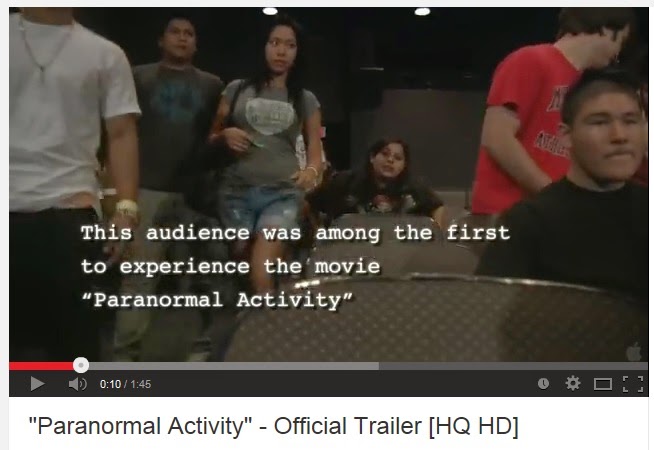
For my second trailer, I decided to look at the film Insidious. Insidious is a American supernatural horror film directed by James Wan. The film is about a family who are trying to prevent evil spirits from trapping their comatose child in a realm called The Further. Insidious is within the horror genre which helps me to explore how horror films are advertised especially as this is the genre I want to focus my film trailer on. This film is a fairly recent film (2010) which would help me to find out what is popular and currently appealing to the present day audiences. Also Insidious was a quite successful movie being the most profitable film of 2011. Therefore this trailer must have been a successful one to encourage so many people to watch the film!


Again this film trailer starts with the warning message, telling the audience what to expect. I think this is very important especially in the horror genre as some viewers may not be the appropriate age to view it. This then followed by a image of the film company and this is when the non-diegtic sound begins, which is the sound of a pendulum.


After this the first shot the view is a mid shot of a male characters in the film. There is diegetic dialogue of a short conversation, "Are you ready?" then "Yes." This short conversation could almost be the characters asking the audience if they are ready for the film to begin.


This medium shot then jump cuts to a close up shot of a pendulum. The ticking noise coming from the pendulum can be heard for a significant amount of time throughout the trailer. The ticking sound is exaggerated  with longer echos from each tick. This creates a sinister atmosphere. The ticking creates a beat for the trailer especially when used as a sound bridge in the following shots of text where the words appear on screen to the beat of the pendulum. Considering the pendulum is heard of quite a while of the trailer, it could be representing that the family are running out of time for their son.


There is medium slightly high angle shot of the family to show to the audience who the film is about.The shots of the family are edited to cut in time with the ticking of the pendulum. The only high key lighting is used when there are shots of the family all together. This then protrays to the audience that these are ment to be the happy times.


However this over-the-shoulder long shot changes the happy atmosphere of the family. The child is seen to be in a hospital bed with an oxygen masks which indicates to the audience that something bad has happened. The pendulum ticking is going and along with diegetic sound of a hospital machinery beeping. The diagetic dialogue following from this shot, “He’s not in a coma, they don’t know what to call it”, also shows the audience that something else is going on. This then gives hints about the story line and makes the audience wonder what else is going to happen.


This high angle shot makes the women appear to be the victim within the story. The camera angle makes her seem weak, vulnerable and can disorientate the audience slightly. Also because this angle is from a humans perspective, it could in fact be from the spirits or ghosts angle instead. There is diegetic sound of someone muttering then a scream saying "NOW!" The audience cant see where the diegetic sound is coming from there creates a spooky feeling. Straight after this the editing becomes fast pace showing that the spirits are in control.


This extreme close-up shot of a woman’s eye while she is speaking to the family is used to express the emotions and thoughts of the women, and maybe even sympathize with her. At the same time diegetic dialogue can be heard of her speaking to the family. The dialogue is about what she thinks is happening to the family. This relieves information about the story line but not too much to give anything away. The background is blurred making her the main focus of the image also the rule of thirds is used with this shot.


Towards the end of the trailer there are lots of really short cuts of action building up a really fast pace. There is non-diegetic sound throughout them high pitched, heavy breathing and clapping that all helps to build up this tense atmosphere that will have the audience on the edge of their seats. The film’s title is displayed again, at the end and the screen goes black.


The black screen makes the audience believe that the film trailer is over. However a really quick, close up shot of a ghost like figure is shown along with a loud screaming noise which leaves the audience feeling scared for one last time. This then also surprises and makes them unaware of what to expect. As it is the last image the audience see before viewing the whole film it needs to have a lasting effect. 
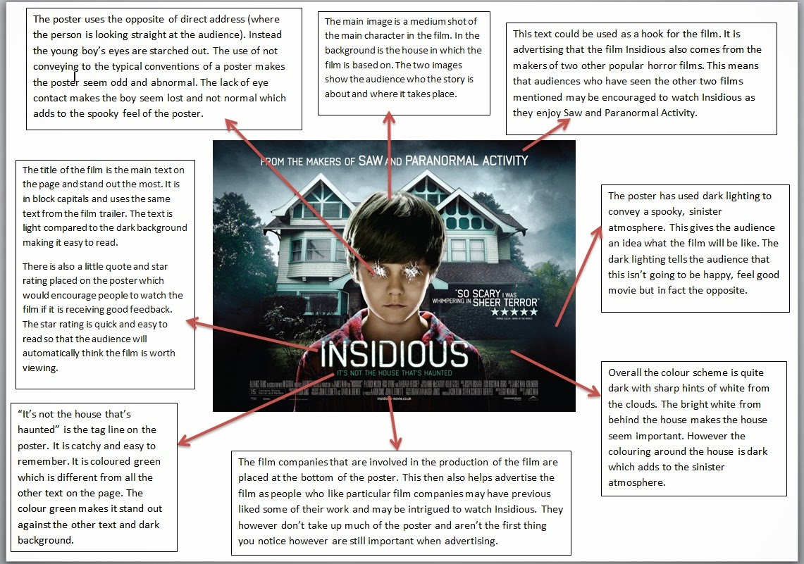
The first film poster I looked at was Insidious. I have already looked at the film trailer for this film and wanted to see how the poster compare.

Reflection on Trailer and Poster

Warning Sign
After looking at this trailer from the film Insidious I will make my own green warning sign for my trailer in powerpoint. These are a typical convention of a trailer and would make mine look professional and more realistic. This sign also implies that the film trailer is for a horror film as the text warns the audience what the film includes such as blood and violence. I will place words like these in my warning sign to make the audience aware of what the trailer includes.

Audience Feedback
On the poster I really like how the poster has placed audience feedback in the form of star rating and a small comment. This is effective yet simple and draws the audiences attention. I want to place a similiar idea onto my poster because even at a glance of the poster, the audience can oick up on the fve stars and know it has had good ratings. I will keep the quote simple but something that will stick in the viwers mind.

Sound
In this trailer, another component that really stood out for me was the use of sound. The pendulum ticking sound worked really well and was an effective use of building up tension. The constant beat made me feel uncomfortable and that something bad was going to happen. I really think this constant beat is really significant and is an idea I want to corparate into my trailer.